The goal of this project was to explore Imposter Syndrome and the Dunning–Kruger Effect, two psychological concepts that strongly affect creative professionals. I needed to create a visual piece (or series of pieces) that explained these ideas in a way that related personally to me and to people in creative fields. I decided on a series of graphic designs using a consistent layout and VS-style split to highlight the contrast between the two mindsets.
I began by researching both concepts to better understand the behaviors, emotions, and thought patterns associated with them.
Imposter Syndrome involves self-doubt, fear of being exposed, perfectionism, and downplaying achievements.
Dunning–Kruger Effect involves overconfidence, lack of self-awareness, ignoring feedback, and assuming skill without experience.
I also looked into color psychology, eventually choosing: Teal to represent Imposter Syndrome (calm, introspective, doubtful) and Orange to represent the Dunning–Kruger Effect (bold, energetic, overconfident)
The first thing I created was an outline template to understand how each is represented and the colors I would be using to represent each behavior.


Next, I researched VS-style layouts inspired by video games. The split-screen format made the contrast clear, dramatic, and easy for viewers to understand. This became the core visual system for all posters.
For the layout I began with a basic ideas found a style I liked and refined and fished it off by putting the text boxes and the VS symbol.


I created simple characters that would be used to show both behaviors. Though their expressions I was able to emphasize how the behavior makes people appear. For instance the Imposter syndrome character appears unsure while the Dunning-Kruger effect character looks over confident and over the top.
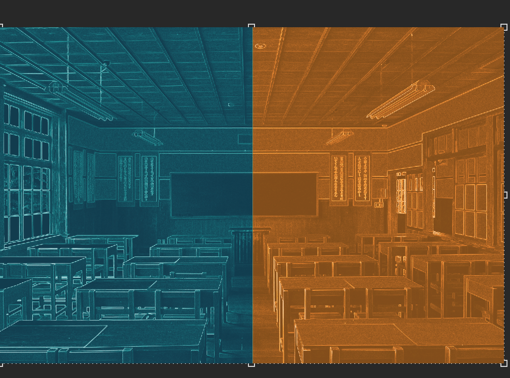
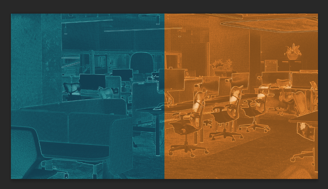
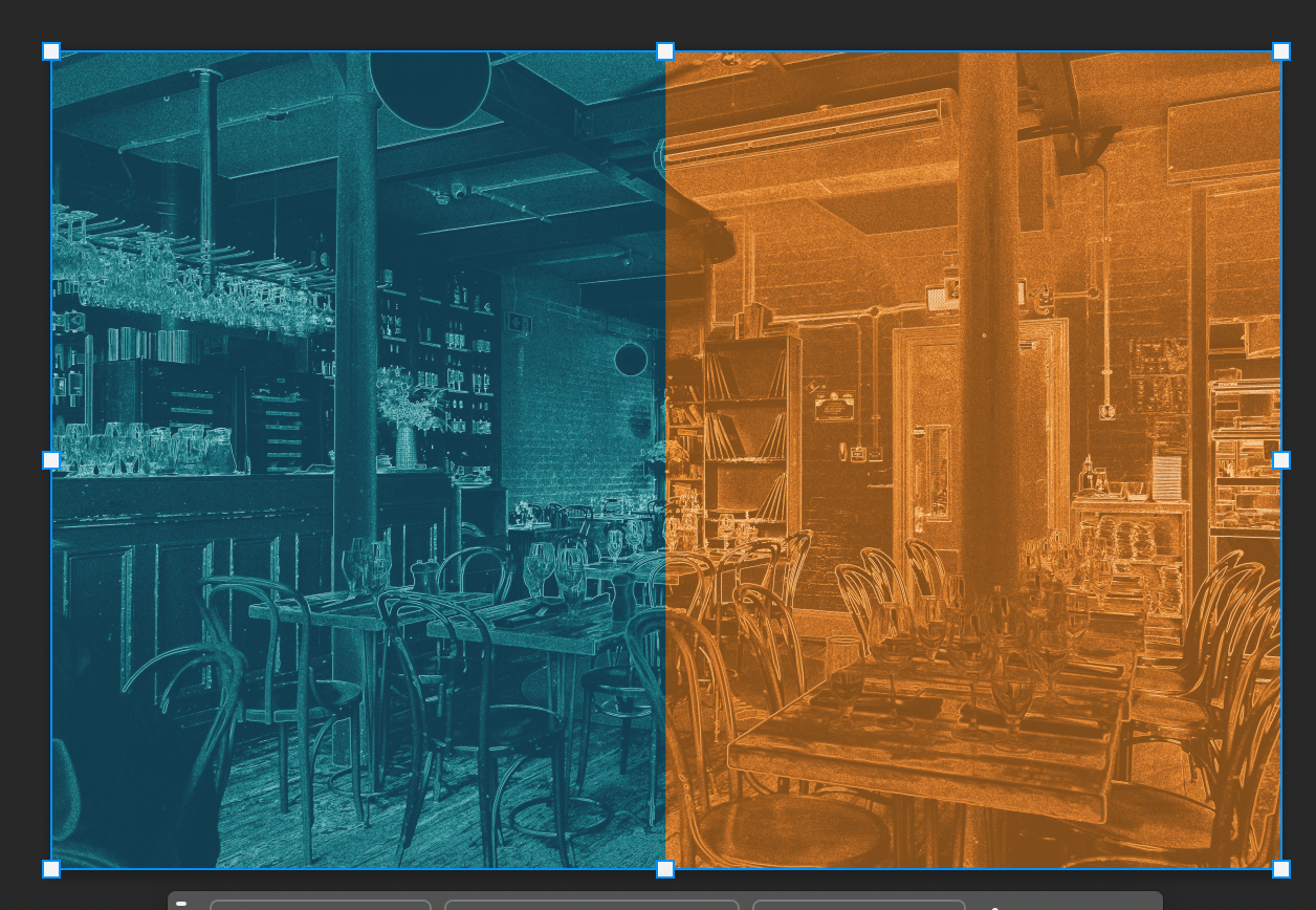

To make the project relatable, I chose four real-life environments where creatives often feel these mindsets:
Restaurant/Café with Friends
Classroom or School Setting
Hardware or Art Supply Store
Workplace or Office
I also added a color gradient on each side of the images to help the images fit in with each behavior style wise.
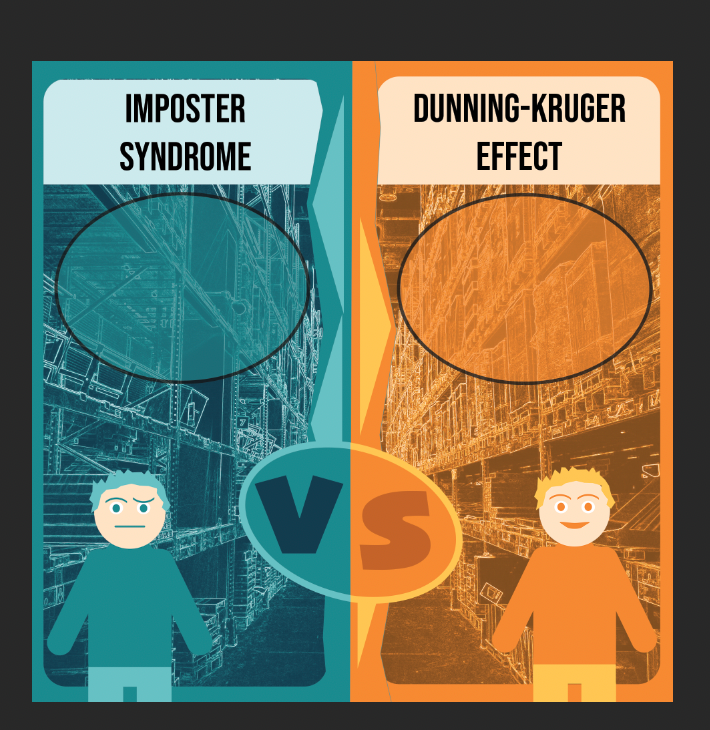

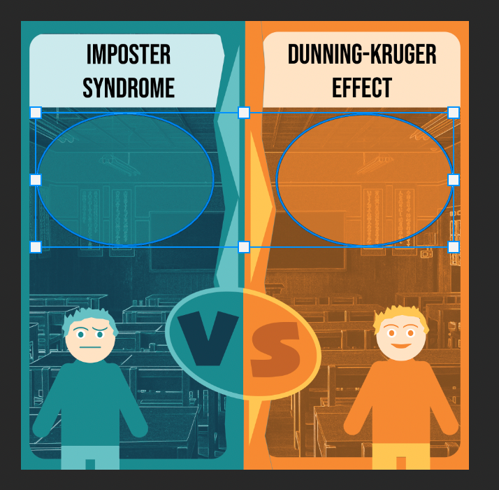

I added all the previous elements together creating the overall design for each poster. To finish each I would just add the text which is possibly the most important element as it easily explains the ways each behavior thinks.
The character’s thoughts teach the viewer what each mindset is. Each quote was written to fit the specific location and behavior shown.
For example:
Café setting → hiding good work vs bragging about rushed work
Classroom → downplaying an A vs blaming the teacher
Hardware store → perfectionism vs ignoring advice
Workplace → over-checking vs refusing revisions
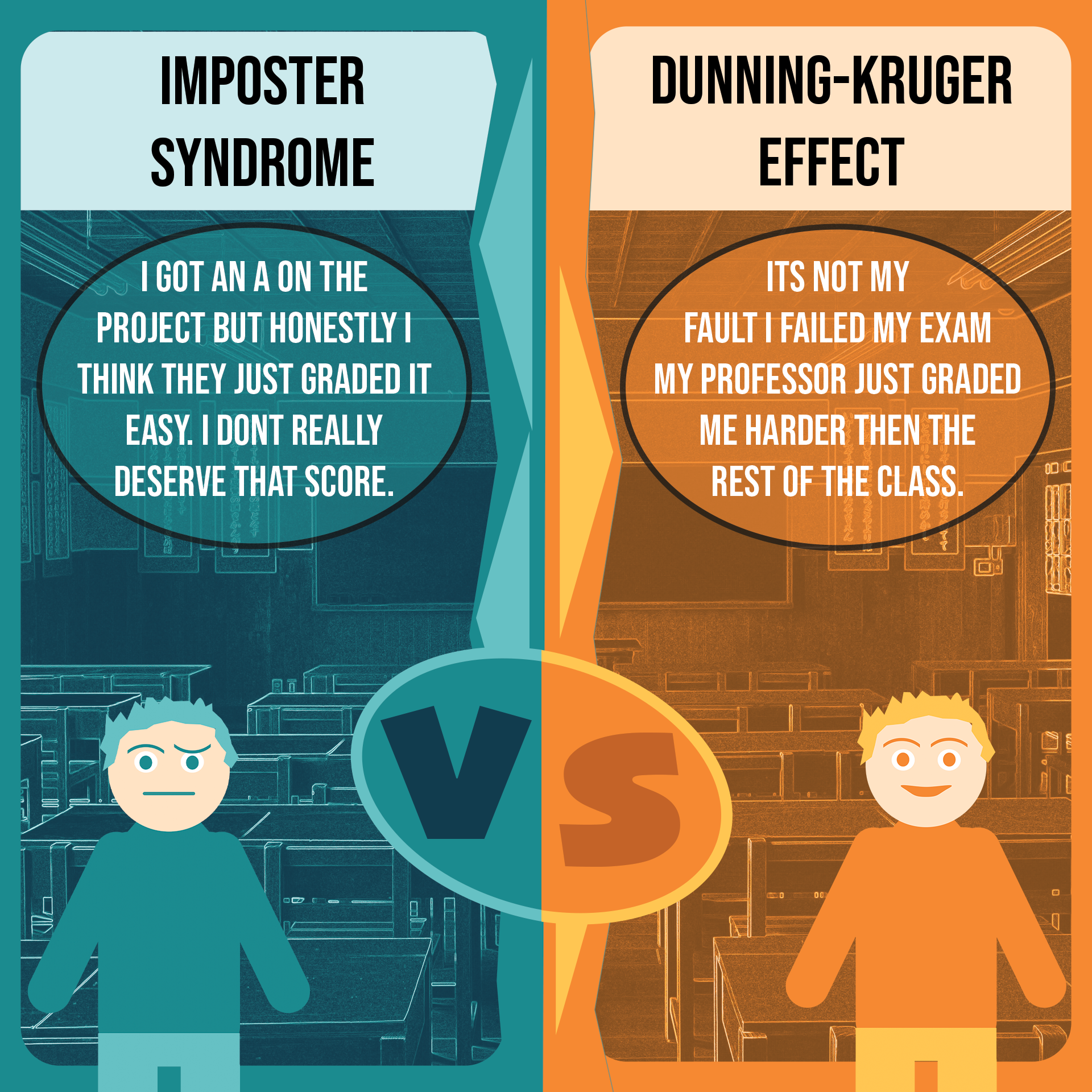
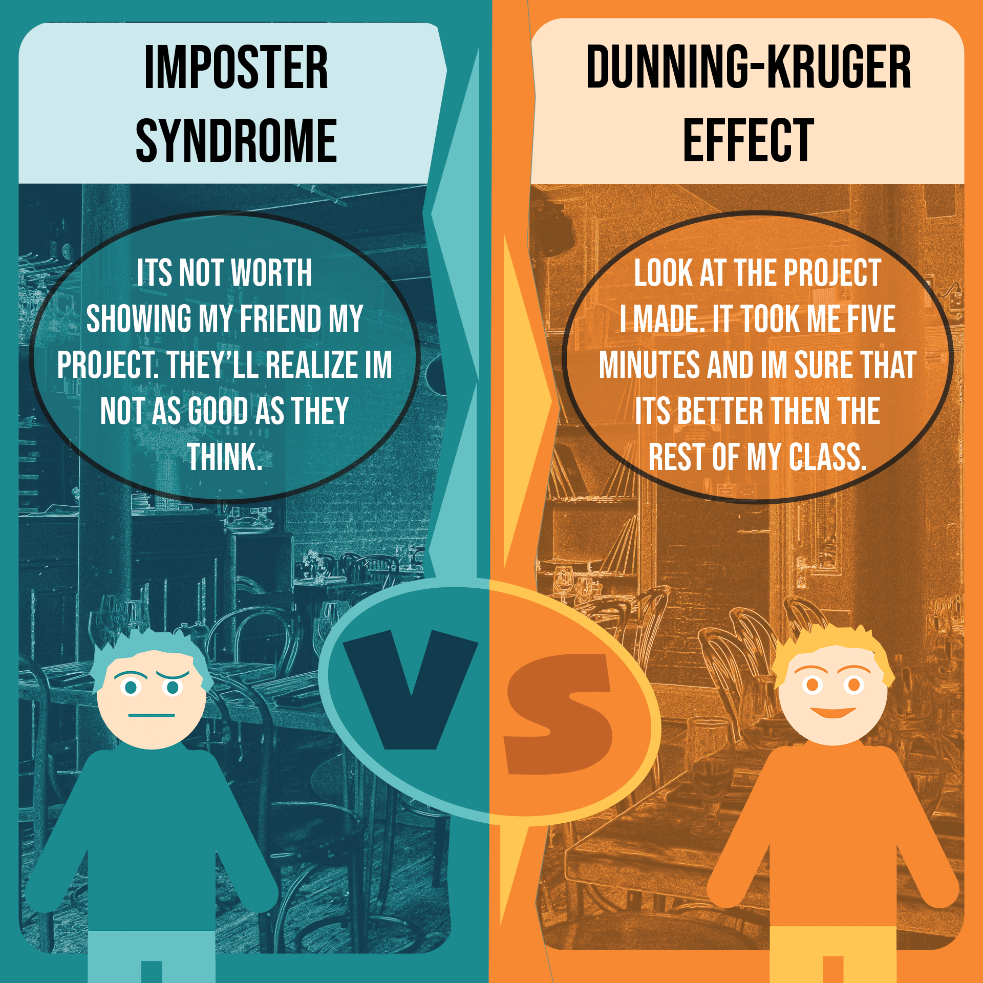

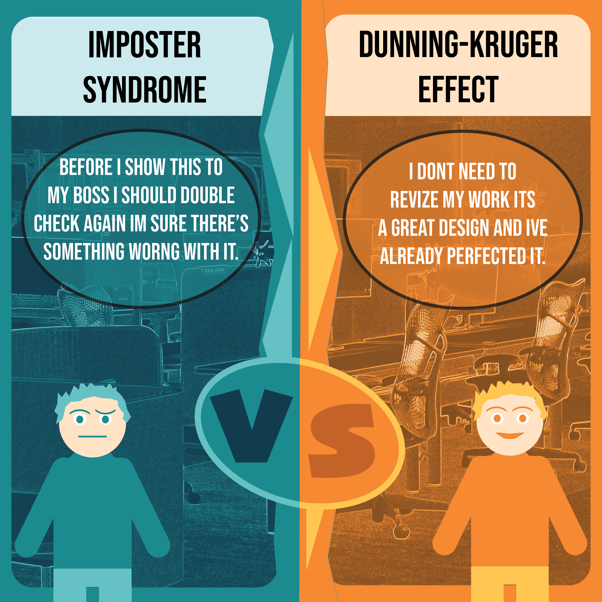
Overall, this poster series successfully meets the goal of visually explaining both Imposter Syndrome and the Dunning–Kruger Effect by placing them side-by-side in everyday environments where creatives commonly experience them. By using consistent colors, a VS-style split, and location-specific quotes, I was able to clearly show the contrast between self-doubt and overconfidence in a way that is easy for viewers to understand. The process of researching, sketching, and refining each design helped me turn two complex psychological concepts into clear, relatable visuals that communicate their meaning without needing long explanations.


